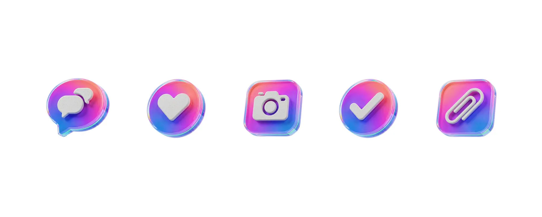
3D Icon Set — KBC Mobile Banking
A 21-icon system for a mobile banking app, rendered in a glossy translucent-blue glass style and anchored to KBC’s brand world — a self-initiated concept that turns the most ordinary interface elements into a brand asset. Hero icons modelled in Cinema 4D, the set scaled with AI, finished as looping motion in After Effects
- Problem — Retail-banking apps almost all reach for the same flat, monochrome icons — clear but cold, making a financial product feel like a utility
- Insight — Split the two jobs: a translucent-blue glass skin carries the brand emotion (premium, trustworthy) while a soft white glyph carries the function
- Solution — A 21-icon glass system in five categories, anchored to KBC’s logo, cards and coins; hero icons locked in Cinema 4D, scaled with AI, animated in After Effects
- Outcome — A complete role-structured set — 2048 px masters plus MP4 motion — delivered as a one-click-export Figma library; concept, not commissioned by KBC
Why 3D for a bank? — trust expressed through craft, not decoration
Banking interfaces have a warmth problem and a trust problem at once. Flat, monochrome icons are clear but cold; they make a financial product feel like a utility rather than a service someone enjoys using. This self-initiated concept answers a single brief: give a banking app a warmer, more premium visual voice without sacrificing clarity. The icons had to read instantly at small sizes (a 24–48 px tab bar or list row), feel consistent across all 21 assets so the app never looks assembled from stock, stay unmistakably KBC — the brand blue, the logo, the card and coin motifs — and be reusable by a marketing team with no 3D skills.
Framing the goal as trust expressed through craft — rather than “make the icons prettier” — set the bar for the whole set: every icon should look engineered
A note on scope: this is a brand exploration, not a commissioned project. KBC did not brief or approve it; I used the bank’s public brand world as the constraint precisely because a real, recognisable identity is the hardest test of an icon language.
Translucent-blue glass skin + a soft white glyph: a two-job system
Three traits hold the family together. A translucent blue glass skin — a navy-to-cyan palette in a frosted, refractive material whose rim catches light and gives each object real physical depth. A soft white glyph paired with solid matte-navy bodies, so the functional symbol stays legible against the glassy highlights. And KBC brand anchors — the logo, branded bank cards and small blue coins recur throughout, tying every icon back to the bank rather than reading as a generic 3D pack.
All renders use one soft studio lighting rig on a neutral background and the same blue material range, so 21 separately-generated icons read as a single family rather than 21 unrelated objects. The glass skin carries the brand emotion; the white glyph and matte navy carry the function. Keeping those two jobs separate is what lets the icons be rich and legible at the same time.
Analytics & Growth — 5 icons; the glass skin and recurring KBC card / coin motifs hold the family together
Lock the look in Cinema 4D, then scale with AI
A few hero icons were modelled in Cinema 4D to lock the look — the glass material, the blue shader, the embossed-glyph depth and a soft studio lighting rig. These references defined the target the rest of the set had to match. With the look established, the remaining icons were generated with AI (a Hugging Face diffusion pipeline), anchored to the Cinema 4D references so the palette, glass rim and glyph treatment stayed consistent. Every render was then cleaned up, recoloured to the KBC blue range where needed, and exported at 2048 × 2048 px PNG on a neutral background.
Locking the material and lighting in 3D first is what kept a glossy, easily-inconsistent style under control — the Cinema 4D references are the reason the AI output reads as one set, not 21 separate generations
Cinema 4D — modelling the hero icons to lock the glass material, shader and lighting
Cinema 4D — refining angle and lighting on the same scene
Financial Management — 5 icons; consistent silhouettes, materials and lighting across separately-generated renders
After Effects — the same render that sits in a list row animates on a success screen
A subset of the icons was brought to life in After Effects as short, looping micro-animations for key moments in the app. Card toss is the hero motion — KBC bank cards flip up and sail along a smooth arc before settling back into place (Card Protection, Card Insights, Digital Wallet, Payment Terminal, Recurring Payments). Coins toss and tumble along the same arc, then settle (Savings Account, Currency Exchange, Investments). The protection shield sweeps in and catches the light, signalling safety (Data Security, Family Shield, Insurance Protection).
Animations were kept short (1–2 s), eased and loop-safe, then exported as MP4 for in-app playback and for marketing / app-store assets — intended for onboarding, empty states and success moments, the few places a banking app can afford a beat of delight. Motion is where a 3D set earns its keep over flat SVG: delivering an animated MP4 alongside the static PNG hands the engineering team both for free.
Card toss, coin tumble and shield sweep — the looping micro-animations, exported as MP4 for in-app and marketing use
After Effects — the kbc_animation composition: card, coins and shield animated on one timeline
Security & Protection — 5 icons; the shield sweep is one of the three looping motion treatments
21 icons, five categories, one Figma delivery file
The 21 icons are organised into five sections that map onto how a banking app is actually navigated — Analytics & Growth (5), Security & Protection (5), Financial Management (5), Communication & Collaboration (3) and Global & Operations (3). Each icon sits on its own 2048 × 2048 px frame, named with its plain icon name for one-click export, alongside an organised catalogue board that hands the set over as a single reviewable artefact.
Communication & Collaboration — 3 icons
Global & Operations — 3 icons
Delivery to engineering: 2× / 1× PNG down-scaled from the master, WebP in the build pipeline for weight, MP4 for the animated icons with a static PNG fallback, and a transparent-background variant for placing icons on coloured surfaces. Naming each frame with its bare icon name keeps the export panel one-click and alphabetically sortable — and should be enforced if the set is ever extended by another designer.
One glass language that could carry a banking brand from the app-store tile to a transaction alert
The result is a complete, role-structured icon system that could carry a banking brand across its whole product surface — from the app-store tile and onboarding, through the home dashboard, to the inline alert on a transaction. In static form it warms up the UI; in motion it adds moments of delight without ever feeling unserious.
What a bank would get from this is an end-to-end icon surface: one consistent 3D language that runs from the app-store tile to the inline transaction alert, anchored to the brand and built on a compact pipeline (Cinema 4D + AI, finished in After Effects) a solo designer can turn around quickly