ai-course.be
A three-minute drill against AI fraud for employees in Belgian organisations. It scores the action that stops a voice clone, a deepfake call or a forged invoice, not the ability to spot one. I designed the app in Figma and built and shipped the landing in three languages with Claude Code; the app itself is not built yet
- Problem — Fraud in Belgium moved to the channels awareness training barely covers: a familiar voice, a video call, an invoice with one changed line. Three seconds of audio are enough to clone a voice, and people spot deepfakes at close to chance
- Insight — Recognition does not train well; a procedure does. Stop, call back on a number you already had, report — it works whether the voice is real or not, so that is what the drill scores
- Solution — Three-to-five-minute sessions on the phone, one rule each, weekly and then a month apart, in Dutch, French and English, built around Belgian works-council rules and AI Act Article 50
- Outcome — 60 hi-fi screens and a design system in Figma, and a landing live at ai-course.be since 17 September. The app is not built and no pilot has run yet. Self-initiated
A voice you know, asking for a payment
Belgians lost €93 million to phishing in 2025, across some 11,000 cases, thirty per cent more than the year before; the figures are the government’s and the banking sector’s. The federal police warn that three seconds of audio are enough to clone a voice. The fraud that works now is a call in the accountant’s voice, a director on a video call, an invoice from a regular supplier with a new IBAN on it.
Most awareness training still teaches recognition: look at the link, look for the typo, look at the face. For AI fakes that is a weak bet. A meta-analysis of 56 studies puts human deepfake detection at 55.5%, barely above a coin toss, and in a UCL study listeners picked out cloned voices 73% of the time, with training helping “only slightly”. ai-course starts from the other side: whatever the fake looks like, the right move is the same.
It is a self-initiated project, written for the BeCentral We Are Founders programme, whose application closed on 20 September 2026. I designed and built it with Claude Code between 2 and 28 September.
ai-course.be — the landing is the product’s public face while the app is still in design
The subject, set as a poster
The three figures on the landing, each with its source
Score the action, not the recognition
The core rule has three steps: stop, verify on a number you already had, report. The drill scores which of those an employee chose, and nothing else. Reporting a genuine email counts as correct, and a false alarm costs nothing, because an employee who is afraid of being wrong stops checking. The same research that made me drop recognition also set the limits of the promise. Ho et al. (IEEE S&P 2025, about 19,500 staff) found no clear benefit from annual training and 1.7 points from training shown at the moment of a click. Lain et al. (IEEE S&P 2022, 14,733 employees over 15 months) found that such training can make people more susceptible, and that reporting by the crowd works.
Both studies tested the page that appears the instant you click, and both measured clicks on email. ai-course interrupts no one: it is a scheduled rehearsal of three to five minutes, one rule per session, weekly and then repeated about a month later, with no timer. The effects of boosters in this literature are small, d ≈ 0.08–0.38 in one study of 19,735 people aged 45 and over, so the pitch promises a rehearsed procedure and a record, not a large effect.
The claim itself is not unique, and the landing does not pretend it is. By September 2026 several vendors were saying that verification is the skill that matters. What I could not find was a dashboard that measures it, so that is the sentence on the page.
One situation in four screens: the practice call, the call itself, four possible actions, and a debrief that names the rule rather than grading the person
The same decision on the landing, in three rules
A Belgian workplace has rules before it has users
A drill at work touches on monitoring employees, so the data model was drawn from Belgian collective agreements before any screen was. Attempts store an outcome code and a timestamp, never what an employee typed or said (CAO 81). An organisation with 50 or more staff gets a works-council notice template (CAO 39). HR sees who completed, not the answers. The attestation says what it is: “attest van deelname, geen wettelijk erkend certificaat”, a record of participation, not a legally recognised certificate.
Every synthetic asset carries an Oefening / Exercice / Exercise label, which is what AI Act Article 50 asks of generated content. I led with Article 50 rather than Article 4: Regulation (EU) 2026/1744 turned the literacy duty in Article 4 into an obligation of effort, while Article 50 has applied unchanged since 2 August 2026. The incoming call is drawn inside the app, with no telephony and no caller-ID spoofing, which the Belgian telecom regulator restricts. Banks, eID and Bpost appear only as fictional brands.
The audience changed once. The early brief said the employees were “often 50+”. On 16 September I dropped that: a 2022 systematic review found no evidence that older adults are over-represented among online fraud victims, and Dutch government research from November 2025 found under-34s click scam links more often than over-55s. The product is for employees of every age, and the ≥18 px text stays because it is an accessibility commitment, not an age one.
The works-council answers on the landing, stacked like cards on a desk
References, wireframes, then 60 hi-fi screens
The app went through the order I use on every project: references first, then wireframes, then hi-fi, all in Figma. IFTTT gave the visual language, black and white with chunky pills and sticker type. Brilliant gave the layout. I measured its screens rather than guessing, and the spacing scale came out of those measurements: 0, 4, 8, 16, 20, 24 and 40, with 12 and 14 kept as component constants. There are 35 wireframes and 60 hi-fi screens at 402 × 874, covering the flow from language choice to attestations, and the states that usually get skipped: empty, loading, error, offline, rate-limited, a code that dies after five tries.
The question screen, wireframe and hi-fi. The four actions became full-width pills; Verify and Report left the bottom bar
Home in four of its eight states: next session, first run, error, offline
The screens then went through 25 rounds of review against WCAG 2.2 AA and Apple’s Human Interface Guidelines. Text below AA contrast went from 3 cases to 0, and text below 7:1 from 5 to 0. Body text is at least 18 px and targets are 44–48 px, because the drill is read on a phone between two other tasks.
Two things I removed from every screen
Every session screen once ended in a help footer with Verify and Report one tap away. I asked when an employee would open a training app while a fraudster is on the line, and the answer was never. The footer came off all 58 screens that had it. The theory of change is memory, not availability: the three steps have to be rehearsed until they are there without the app.
Report moved into the navigation bar, and then lost its word. “Report” read as “report a bug in this app”, and it collided with the third step of the rule the drill teaches. Five presentations were built and compared; a bare warning-shield icon at 24 pt with a 44 pt hit area won. Banks that face the same problem label it “Suspected fraud” or “Identify a scam”, never “Report”. The shield sits on the 29 screens where a session is in progress or has just ended; the call simulation and first launch have none on purpose.
Verify and Report as sheets. The last row of Report only applies when the money has already gone, and says so
Two colours, one typeface, every value a variable
The design system is deliberately small: ink #222222 and white, with greys only for secondary text. It holds 104 variables in eight collections and 36 text styles. Every gap on the screens is bound to a variable, and 69% of the nodes on a screen are component instances, so a change in the library reaches all 60 screens. The web uses Neue Haas Grotesk from Adobe Fonts, while the Figma file still uses Helvetica Neue: that face ships only with macOS, and Belgian offices mostly run Windows.
App components. A swap that keeps the height and the tap target is a property; a change of structure is a new component
The sticker type is the brand’s one loud element: words and icons with a double outline, used for exercise labels and on the landing. The first version drew the outline as rings, and the rings filled in the counters of letters like o and e. Since 8 September each sticker is two layers, a solid face under the letters, and every sticker is baked to outlines so it renders the same everywhere.
Stickers in three languages and at four sizes, plus the icon set
A landing that says what is not built yet
The landing is a separate React and Vite site, prerendered per language at /, /nl/ and /fr/, and deployed with Coolify on my own server. It went live on 17 September with Dutch and French on the same day. Its web layout was measured on Brilliant’s site in the browser, so the move from the phone screens to the desktop is documented rather than invented: the section step goes from 40 to 80, while the card radius and the 56 px button stay. Body text is 20 px.
The drill screens framed in a render of an iPhone 17 Pro, the phone model from my Decode project; its window has the proportions of the 402 × 874 screens, so a real recording can replace each still later
Why now: the three channels are dealt one by one as the section scrolls
Four differences, each small enough to check
Nothing on the page claims more than exists. The status line reads “In development · pilot places for autumn 2026”, the footer says the product is not for sale yet, and the pricing section shows no number yet: one price per organisation, put in writing without a scoping call, and indicative until the pilot settles it. Claims age, so the retired ones are pinned in the tests. “No competitor cites Article 50 by number” was in my notes on 4 September; a later check found a vendor that had cited it in July, and a test now fails if that sentence comes back.
Typesetting is a rule, not a pass. A typeset function binds short words, articles and prepositions to the next word, keeps numbers with their labels, so “CAO 81” and “a pilot” never split, and keeps a dash off the start of a line. A browser test reads every rendered line break at five widths in three languages. The first run found 47 bad breaks; it reports none now.
Dutch, at /nl/
French, at /fr/
The 404 is a small game: a rocket and seven fakes to knock down. The server still returns a real 404
Twelve jobs, and no targets before the baseline
The product documentation follows the job-story format: twelve jobs across a Notice → Act → Return loop, one feature set per job and at most two metrics each. The North Star is the change in correct-action rate for the same employee between the first session and later ones, measured from the attempts table. Two kinds of metric are kept apart. Contract metrics are invariants, such as no unlabelled asset or the Fraudstop row on every Report sheet, and a miss is a bug. Behavioural metrics get no target until the pilot has a baseline; the commitment is to measure them and publish the result, including when it disappoints.
The jobs board. Bold rows are social or emotional jobs
One of the three loop boards the jobs were drawn from
The screen map, grouped by flow
What Claude Code did, and what I decided
Claude Code wrote the landing’s code: all 116 commits carry its co-author line. It also ran the measurements, the review rounds and the audits, drafted the research, and built the Figma screens and variables through the plugin API. I chose the problem, the audience and the scoring rule, set the visual direction and the order of work, decided what to cut, and accepted or rejected each result.
The corrections went both ways, and mine are on record in the project’s decision ledger. The first landing arrived as code with no wireframe, no hi-fi and no reference; I stopped it and restarted in the project’s order. A scripted measurement of the reference screens read two to four points short, and my hand measurement replaced it as the ground truth. The help footer and the word “Report” both went because of questions I asked about how the product would actually be used.
Nobody opens a training app while a fraudster is on the line. The rule has to be there without it
What is not done
The app is designed, not built: no scenario has been generated and no employee has taken a drill. I have not interviewed users yet, and the copy has not yet been read by the younger employees the corrected audience includes. The plan is two months to build, twelve scenarios in Dutch and French, then a pilot with three to five Belgian organisations of 20 to 250 people. The pilot sets the baseline for the behavioural metrics, the price and the works-council pack.
The landing has open items of its own. Its secondary notes are set at 16 px, below the 18 px the page commits to for body text, and the Figma file still has to switch to Neue Haas Grotesk. The site has 246 unit tests and 249 browser tests, which check what they check; they are not a substitute for a person using the drill.
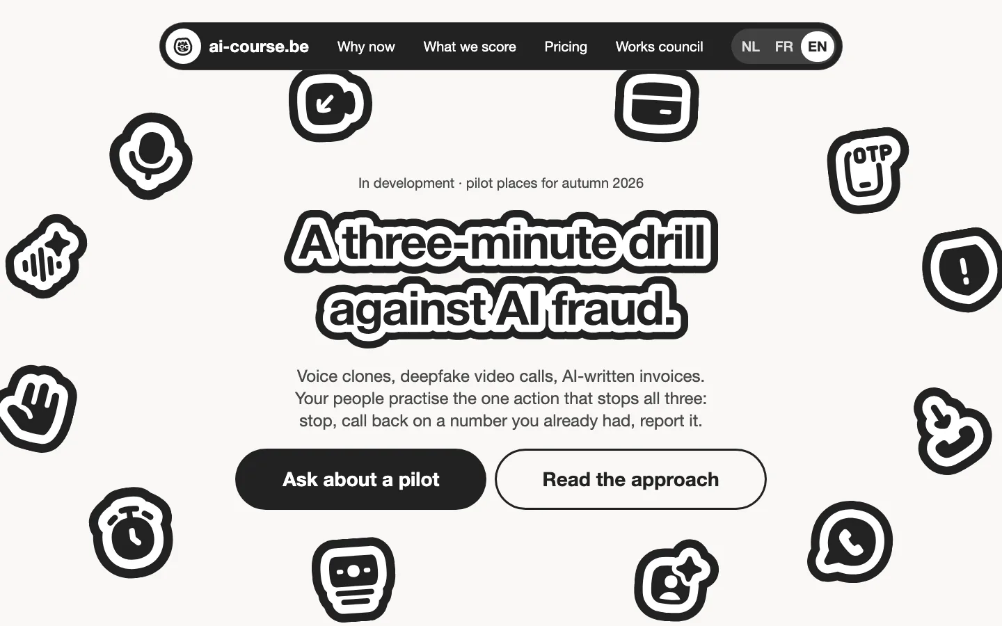
Live — ai-course.be
Sources
- Ho, G. et al. (2025). Understanding the Efficacy of Phishing Training in Practice. IEEE Symposium on Security and Privacy. — embedded and annual training, measured on email clicks
- Lain, D., Kostiainen, K. & Čapkun, S. (2022). Phishing in Organizations: Findings from a Large-Scale and Long-Term Study. IEEE Symposium on Security and Privacy.
- Diel, A. et al. (2024). Human performance in detecting deepfakes: a systematic review and meta-analysis of 56 papers. Computers in Human Behavior Reports.
- Mai, K. T. et al. (2023). Warning: Humans cannot reliably detect speech deepfakes. PLOS ONE 18(8).
- Regulation (EU) 2024/1689 (Artificial Intelligence Act), Article 50: transparency obligations for providers and deployers of certain AI systems.