Tenderdex
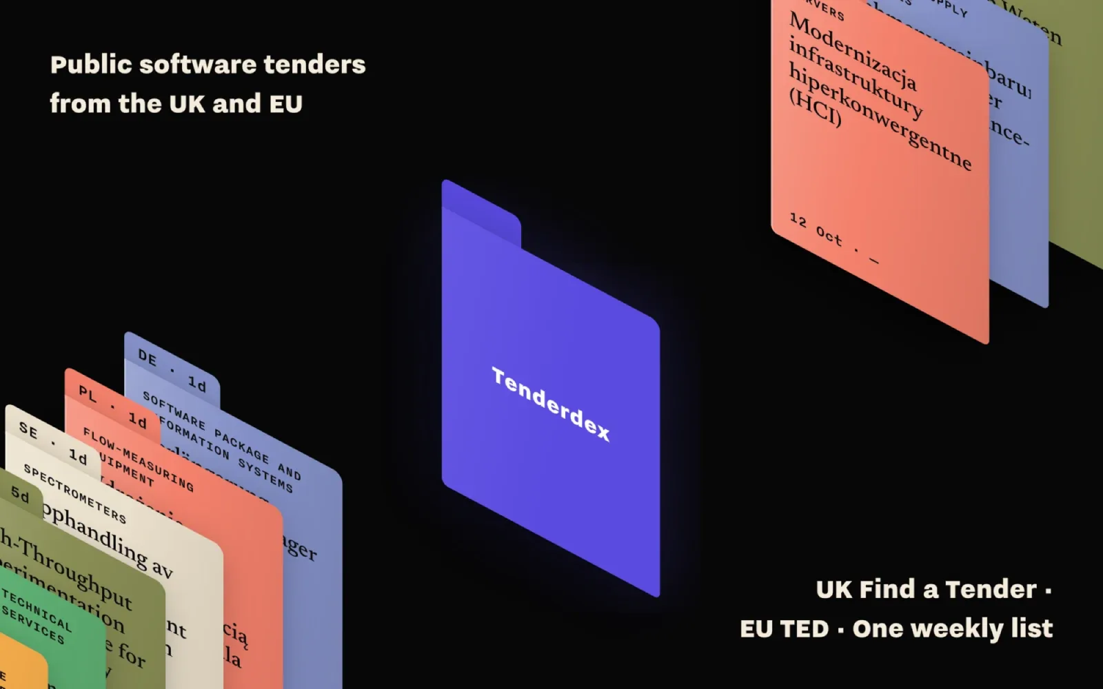
A weekly list of public software tenders from the UK’s Find a Tender and the EU’s TED, ranked against what a small supplier sells. It started in May 2026 as a tender-monitoring tool for SVP Consulting, an Antwerp AI consultancy; in October I redesigned it around one metaphor, an archive of folders, gave it a landing page and launched it on its own domain for any small supplier. Formerly “UK & EU Procurement Radar”
- Problem
- UK notices sit on Find a Tender, EU notices on TED, in two data formats and twenty-odd languages. A ten-person software firm has nobody paid to watch both
- Insight
- Most of what the portals publish cannot be bid on: on 11 October 2026, 1,900 of the 11,190 notices on file were open tenders. The list has to start there and say why each one fits
- Solution
- One list from both sources, scored 0–100 by five visible rules against a profile kept in the browser, in an archive-folder interface chosen from ten concepts
- Outcome
- Live at tenderdex.com and app.
tenderdex.com since 8–9 October 2026, after review rounds that closed a path traversal and an audit that fixed a deadline bug
Two portals, two formats, and nobody paid to watch them
Public bodies in the UK publish their tenders on Find a Tender as OCDS JSON; across the EU they go to TED as eForms, in the buyer’s own language. The two share no search and no code lists. Poland, Germany and Spain alone account for 7,075 of the 11,190 notices Tenderdex held on 11 October 2026, mostly in Polish, German and Spanish, so a search for “imaging software” in English never finds a Polish hospital buying PACS software.
For the public version I designed for founders and BD leads at software, IT-services and e-learning firms of 1–50 people, with no bid team. Their pains in the brief come from desk research and are marked as hypotheses, and the landing page shows data where testimonials would usually go.
Before: the data prototype in June 2026. The scoring and the data model survived the redesign; the interface did not
Designed and directed by me, built with an AI pair
The tool began inside SVP Consulting; I chose the audience it grew into and the scope: discovery and triage only, no bid writing, no CRM, no accounts and no pricing page. I chose the metaphor, the concept, the type direction and the hero layout, rejected the options listed below, and reviewed the screens round after round. Some of those reviews are in the pull requests in my words: rows aligned to the first line of the title, the folder running down to the CPV dividers, one header grid for the app and the page.
Built with Claude Code: I set the brief and the constraints and reviewed every change before it landed.
A pixel wall of every notice and a split-flap departures board came back with the folders. I cut both: one metaphor only
That rule went into the decisions log on 6 October, and every later choice was checked against it. The same week I had asked for the layout of a Lowe advertisement for the hero, and got its cream background and serif type as well; the desk stayed dark, and only the placement came across.
May: the data model first
The first version was built for SVP Consulting at the end of May 2026, after a research pass that checked both APIs with live anonymous calls. Each source has its own mapper into one model, with IDs prefixed UK: and EU: so the two never collide, and the original record kept for tracing. The score is a weighted sum of five rules, so it can be checked by hand: CPV match 35%, keywords 25%, value in range 15%, days to deadline 15%, buyer history 10%. Every part comes with a plain reason, such as “Only 1 day left — less than your 7-day minimum”. Notices are pulled every Monday at 06:00 UTC.
It ran on my own server from June, and it looked like a generic dashboard. In October I started the redesign without changing the scorer or the data model.
One metaphor, chosen from ten
I collected a moodboard of over a hundred archive references: folder tabs, index cards, colour-coded dividers, drawer labels. Ten concepts came out of it in Figma: a ledger, folder tabs, a form with a stamp, cabinet drawers, a colour index, a microfiche reader, an open case file, a Rolodex, a card catalogue and a blueprint manual. I chose folder tabs. In version 02d the app is a black desk, the list a cream folder lying on it, coloured tabs as the quick filters and CPV dividers down the right edge.
The ten concepts, filled with mock data. Number 02, folder tabs, became the app
The type took longer than the layout. Concept 02 went through twenty type variants before I settled on Nitti Grotesk for the interface, Nitti for metadata and Newsreader for tender titles, the scheme of iA Writer Pro. I asked for the sizes to be measured on donor sites rather than picked by eye: the scale comes from ia.net in 2016, the display sizes from the ia.net/writer hero and from Brainport Eindhoven, which is set in a cut of Nitti Grotesk. Tender titles take 19/32 rather than iA’s 24/32, which wrapped them to four lines in a table column. The light theme was dropped: one theme, the desk with paper on it.
Before any Hi-Fi, the live app was wireframed in grey: 28 screens built from components, on variables that switch to a Hi-Fi mode. The Hi-Fi covers the whole screen map, 23 desktop and 6 mobile screens, and DESIGN.md documents the system for the code.
A row of real notices, and one folder pulled out
The landing hero takes its layout from the Lowe ad on my moodboard: a row of folders runs corner to corner, the headline sits top left, the buttons and one line of facts bottom right. Every folder in the row is a real open notice from the last snapshot, coloured by country, with its category and its title in the original language. One violet folder is pulled out of the row. As you scroll, the row parts, the violet folder turns to face you and opens into the first section; folders 02 to 07 stack after it.
tenderdex.com: the counts in the fact line are read from the data on every build
Scrolling: the row parts and the violet folder straightens
It opens into folder 01, which carries the problem in three lines
The copy follows the data. The first headline promised “every public tender”; a count at the time showed that 99.8% of notices do carry the software and IT codes, but only 1,719 of the 11,090 then on file were open, and Find a Tender and TED only publish above the procurement thresholds. The headline became “Public software tenders from the UK and EU. One weekly list.”, and the fact line now leads with open tenders. The page is prerendered, so its text arrives as HTML; on phones and with reduced motion the folders sit in a static stack.
Landing, 375 px
The 404 page: the 404 folder pulled out of the drawer and stamped “Not on file”
Open tenders first, a profile in thirty seconds
The app opens on open tenders only, sorted by deadline. There are no accounts: the browser keeps a random ID, and the profile behind it holds CPV codes, keywords, countries, a value range and the minimum days needed to bid. A first visitor sees one paper slip on the folder, “Rank these notices for your firm”, with three presets (Software & IT, E-learning, R&D & analytics) and a link to set it up by hand. Every preset code is checked against the official list and had open notices on the day it shipped. Once a profile is saved, the list switches to best match.
app.
CPV codes are where newcomers get lost, so every code is shown with its name from the official CPV 2008 vocabulary: all 9,454 labels, loaded only when needed. In the profile the comma-separated text box became a searchable combobox that takes words or code prefixes. The tour no longer starts by itself; a one-line hint offers it.
A notice: the deadline with the real local time, the CPV codes with their official names, and a direct link to the source
The profile: search the CPV list by word or by code
How a score is explained: a worked example on the landing, not a live score
Overview: what is open, by source, category and country
App, 375 px
Reviewed and audited, not yet tested with users
All the checks so far are AI audit passes against a checklist, plus my own visual review rounds. Five review rounds ran before launch and five more against production on 9 October: code, security, WCAG 2.2 AA, functional QA and performance. A full audit followed on 9–10 October, and each finding was reproduced in the code before it was fixed.
The worst finding came from the security round on 9 October, in the oldest code: since May an encoded slash in the URL could make the app serve any file in its container, its own source included. It was closed, a test was added, and CI now boots the image and tries it. The audit then found that deadlines given as a date without a time were read as the start of that day, which closed notices 10 to 20 hours early; values of 0 or −1 scored as real amounts; TED publishing one tender under several numbers, so 88 duplicate rows are hidden and older versions of a re-published tender give way to the newest; and an Open count that included contract awards, 2,367 instead of 1,727 on that day. Requests over 64 KB are now refused, and reads, scored reads and new profiles are rate-limited.
The design-system pass left one token vocabulary for the app and the landing, deleted the legacy palette and the remap layer (the main stylesheet went from 758 lines to 230), set a type floor of 15 px on desktop and 13 px on phones, and reserved space so nothing jumps: scrolling through the hero shifted the layout by 0.097, now 0. axe-core found no violations in the states checked at 1440 and 375 px, and Lighthouse rates the app’s accessibility 100 on mobile.
Live on its own domain, with the numbers it can stand behind
Tenderdex is live: the landing at tenderdex.com, the app at app.

Live — app.
What is still open
A weekly email digest of new matches, which the data model already allows for. The title language in TED data is unreliable, so the lang attribute on titles comes from the buyer’s country and is left off for Belgium and Luxembourg. On a throttled phone the landing scores 79 for performance, held back by the render-blocking font stylesheet. The trademark check for the name has not been done.
