City Planner — multi-city amenity siting tool
A geospatial engine that tells three European cities where to put the next public toilet, bench or defibrillator — equity-weighted scoring over an H3 hex grid, walking-network coverage, and a one-page Decision Brief, at £0 where enterprise GIS starts at £100k a year
- Problem — Cities pay consultants £10k–£100k+ and wait 4–8 analyst weeks to decide where a bench or toilet should go — on GIS platforms that cost up to £280k/year
- Insight — Across ~35 tools audited, the ‘recommends new points’ column was empty everywhere except academic papers — that empty column is the product
- Solution — I built solo an open-data engine: H3 grid, gap × equity scoring adapted from Tree Equity Score, greedy/MCLP optimisation, before/after coverage and a print-ready Decision Brief
- Outcome — Live for Paris, Antwerp and London — 8 asset types, 24 city × asset datasets; e.g. 10 new toilets lift Antwerp coverage 17.4% → 24.0%; £0 hosting
Deciding where a public toilet goes costs months of procurement and five-figure consultancy
Urban infrastructure siting looks simple from the outside and is politically charged and analytically expensive inside councils. The typical pathway: an officer identifies a need, a consultant engagement is procured over months, a proprietary GIS analysis is run on platforms that can cost upwards of £280,000 a year at enterprise scale, and a report lands whose methodology the officer can neither inspect nor reproduce. Three personas carry the pain: the public-space officer who must defend “why this street” in committee, the policy researcher who has no uniform multi-city methodology, and the grant writer who needs quantified before/after evidence to attach to an Interreg or NEB Facility bid.
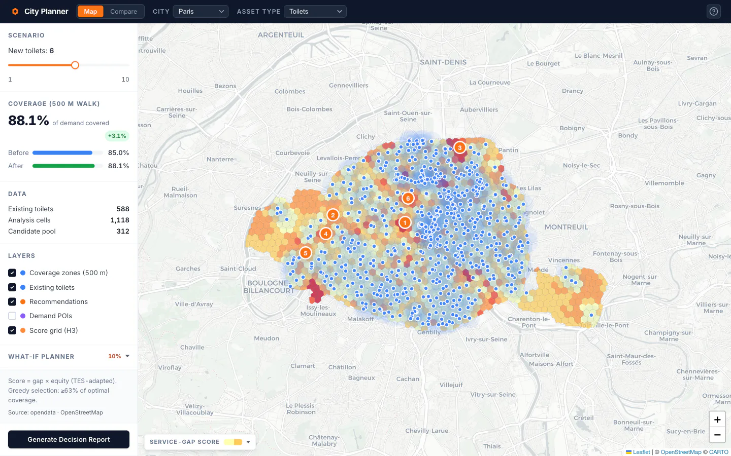
Paris / public toilets: 500 m coverage circles, ranked recommendations, budget slider with before/after coverage
No open tool answered the siting question with both equity-weighted scoring and before/after coverage proof — they visualised gaps or collected opinions, and stopped there
Thirty-five tools audited — and one column empty everywhere except academia
Discovery combined four methods: a competitive sweep of ~35 tools across enterprise GIS, civic-tech participation platforms, accessibility scoring and sensor analytics; an academic literature review (2SFCA, MCLP, Kolm-Pollak EDE); an open-data audit of all three cities; and methodology benchmarking against American Forests’ Tree Equity Score, Conveyal Analysis and TfL Healthy Streets. The scorecard converged on one finding: Conveyal quantifies before/after but the planner draws the scenario by hand; UrbanAccess and CityAccessMap surface gaps only; Esri answers it semi-manually for £££ and a trained analyst. The ‘recommends new points’ column was empty everywhere except academic papers — which are not products.
Tree Equity Score supplied the methodological blueprint — multiplicative scoring, equal-weighted equity indicators, before/after framing, a transparent methods page. Adapting the most rigorous public-sector precedent in an adjacent domain bought the methodology credibility with a sceptical audience from day one, and saved weeks of scoring-design iteration.
Start from the strongest public-sector precedent in the adjacent domain — then substitute canopy gap with toilet access, census blocks with an H3 grid, and US indices with FILOSOFI, BIMD and IMD
Gap × equity on a hex grid — multiplicative on purpose
Every ~0.1 km² H3 cell gets Score = 100 × (1 − GapScore × EquityIndex). GapScore is the walking-network distance to the nearest existing asset (OSMnx + multi-source Dijkstra) over the city maximum; EquityIndex composes real deprivation data — INSEE FILOSOFI for 645 Paris IRIS zones, Statbel BIMD for 261 Antwerp sectors, ONS IMD for 5,666 London LSOAs — floored at 0.1 so zero deprivation never erases a real physical gap. Multiplicative, not additive, by test: the additive formula recommended four Paris locations with high deprivation but adequate existing coverage; the multiplicative one did not.
Recommendations come from greedy max-coverage — guaranteed ≥63% of the mathematical optimum (Nemhauser 1978) with geographic spread built in — with an exact MCLP solver (PuLP + CBC) selectable per run; in practice the two agree to within 0.1 pp. The network distances matter more than they sound: for London toilets, straight-line buffers claimed ~33% coverage where the walking network shows 13.2% — rivers, parks and motorways had been quietly flattering the map.
The H3 score grid — pale yellow is well served, dark red is high priority; numbered markers are the engine’s recommendations
Architecture is a deliberate split: a Python engine precomputes everything offline — data download, cleaning, per-city metric CRS, grid, scores, optimisation, precomputed budget-slider scenarios — and the React app serves static GeoJSON with no live backend. Intelligence in Python, delivery in React: the analysis is expensive, the hosting is £0.
Three cities, one methodology — and a story no single-city tool could tell
The same ten-toilet budget produces three very different answers. Paris (588 sanisettes, the cleanest open-data pipeline in the set) already covers 85.0% of demand-weighted cells within a 500 m walk; ten more lift it to 89.8%. Antwerp covers 17.4% with 91 mapped toilets — ten new ones raise it to 24.0%, the highest marginal return per facility of the three. London covers 17.5% at far greater physical scale; ten facilities move it just 0.9 pp, a diminishing-returns dynamic that argues for a longer capital programme and better data before optimisation.
Antwerp — the strongest equity case: highest marginal return per new facility
Compare view — explicit normalisation banner: a 60 in Antwerp is not a 60 in Paris
The end artefact is a Decision Brief: a print-ready one-pager with the ranked locations, per-component methodology, data sources with confidence ratings, and the before/after number a grant writer actually needs. Data honesty is a product feature rather than a footnote — OSM’s under-mapping of deprived and peripheral areas understates the gap exactly where equity need is highest, and every Brief discloses it.
The Decision Brief — the one-pager a grant application can attach as evidence
Live — 3 cities, 8 asset types, 24 precomputed datasets, what-if planner included
What the numbers are — and what they are not yet
This is a solo portfolio project, not a commissioned deployment: the impact numbers are analytical outputs from live open data, benchmarked against documented procurement timelines and published tool pricing — not a user study. The tool is technically complete across all 24 city × asset combinations, and no city planner has used it yet; a structured validation sprint with city-adjacent users is the most important item on the roadmap, and scheduling it after launch instead of during Phase 3 is the first thing I would do differently. The identified v2 white space — a RAG layer that cites a city’s own policy documents when explaining a recommendation — is claimed by no competitor in the audit.
Walking skeleton first: one city, one asset type, end to end — every later city was an adapter on a working base, not a re-build
Sources
- American Forests. Tree Equity Score — methodology. — the scoring blueprint this project adapts for European cities
- Nemhauser, Wolsey & Fisher (1978). An analysis of approximations for maximizing submodular set functions. Mathematical Programming 14. — the ≥63% optimality guarantee behind greedy max-coverage