Decode
An AI decoder for UK pay-later agreements that shows what checkout never says out loud — designed end to end, from research to 115 hi-fi screens, and built by me as a live PWA
- Problem — an active UK pay-later user makes 2.6 purchases a month and borrows £168 across them, and checkout never says the word “credit” out loud
- Insight — my own premise broke: 89% of users say keeping track is easy. The job is not “keep track”, it is “don’t get caught by a debit”
- Solution — one true-cost number calculated by code, not AI, the traps, a yes/no on the credit file, every figure tapping back to its line — then Radar watches the debits. I owned research, product, UX, the design system and the build
- Outcome — live, pre-launch: 280 commits, 677 backend tests, 86 audit findings fixed in a day; a moderated test with five people is next
A scanner for the paperwork you already signed
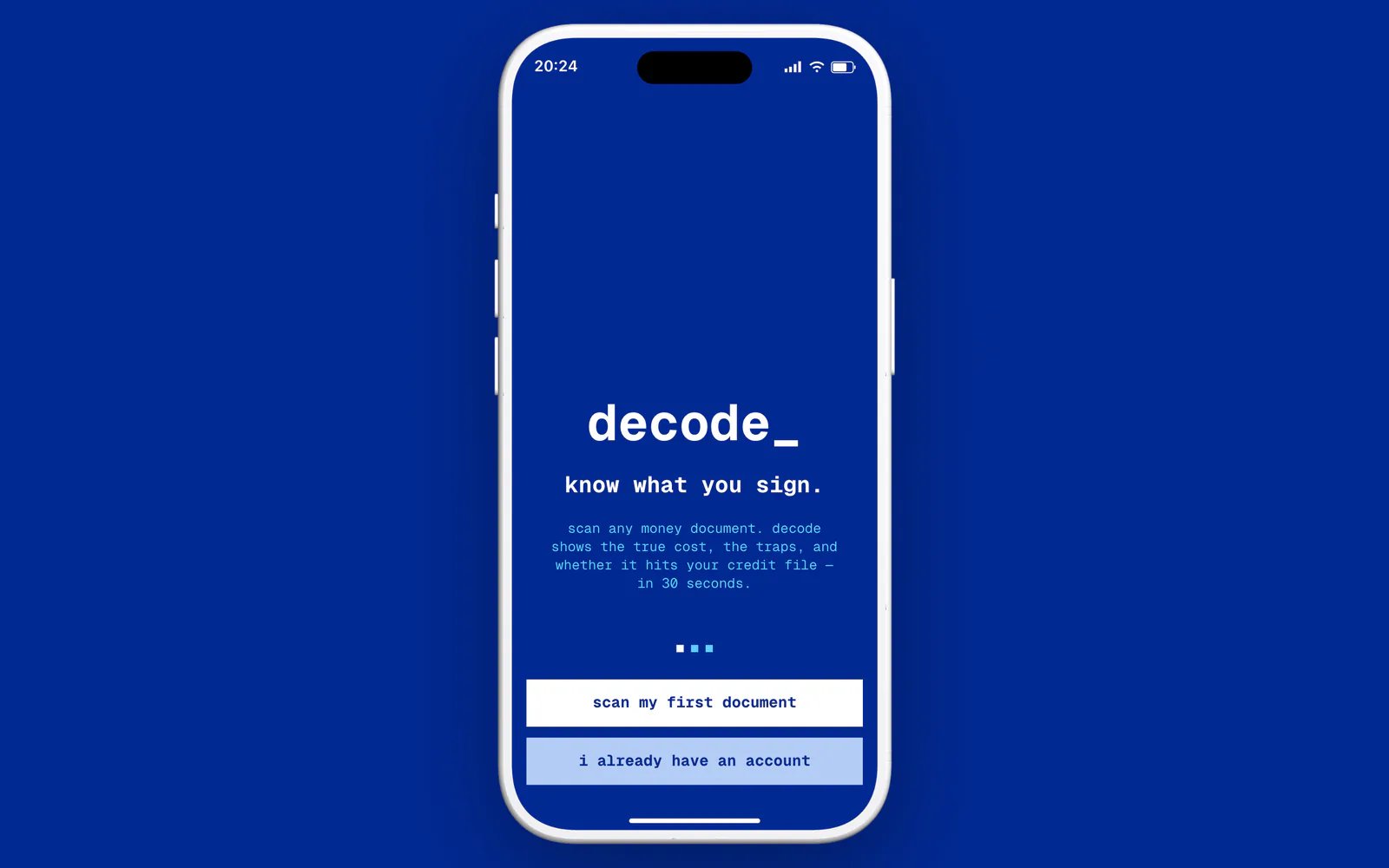
Decode reads a UK pay-later agreement, a bill or a scary letter and gives back three things: one number for what it really costs, the traps written into the small print, and a line you can tap to see exactly where that number came from. iPhone first, UK first, and no bank link: the document is the input.
The metaphor decides the interface. A contract is machine-readable to everyone except the person signing it, so Decode takes the machine’s side and hands it back. The product speaks in monospace, quotes the source line and shows its working: a visible processing pipeline instead of a spinner, and “Calculated, not AI” on anything a formula produced.
The product in one sentence, in the product’s own voice
The metaphor: the machine reads it for you
The working, shown: stages instead of a spinner
Pay later is small, frequent and quiet
The average active pay-later user in the UK makes 2.6 purchases a month and borrows £168 across them, according to the FCA’s transaction data from the three largest firms. Citizens Advice found that 89% of retail sites leave the credit nature of the offer in the small print, and that one in ten pay-later shoppers has been chased by debt collectors. The FCA starts regulating the market on 15 July 2026.
The gap is not arithmetic. It is that checkout never says “credit” out loud, and a missed payment can sit on a credit file for six years.
The problem, with receipts: every figure carries its source in the card
My own data broke my premise
The first hypothesis said people lose track of their plans. The FCA’s own survey says the opposite at segment level: 89% of pay-later users find keeping track easy, 86% at 18–24, and 67% pay by direct debit. A product framed as “help you keep track” would argue with its user on the first screen.
I kept both numbers on the same page instead of dropping the inconvenient one, and went looking for where the pain really sits: with heavy users. Among people who owe £500 or more, “easy” falls to 77–78%, and the FCA itself describes the risk of losing the thread across lenders, then declines to require a combined view. So the job changed from “remind me of the date” to “don’t let a debit catch me”: what leaves the account, on which day, from which card, across providers that never see each other. The decode became the way in; the portfolio and Radar became the product.
The same rule applied to my own copy: re-reading the FCA paragraph, I found I had written £168 as “owed at any one time”. It is borrowed per month, and the landing was corrected the same day.
Evidence that is hard to fake
64 research reports and 19 analog teardowns, and a strategy reset on 31 August run as twelve parallel research agents on primary sources. Four segments were scored on seven weighted criteria, and “accidental borrowers”, pay-later users aged 18–25, won at 4.25. Fifteen jobs, functional, emotional, social and adjacent, are each tied to the flow that answers them; twelve carry a feature and one or two metrics, under a North Star of documents taken to “decision made”.
The evidence came from sources that are hard to fake: about thirty verbatim one-star reviews from five rivals, coded by theme and severity so that each rival’s failure became one of my requirements, and a pre-mortem that wrote six requirements as if the product had already failed. The interview guide, Mom Test and JTBD switch format for six to eight people, is ready for the next round.
The Segment & JTBD board: every job card names the flow that answers it
Six phases, one reversal
Four tabs, one centre action
Home, Radar, Scan, Vault, Settings. Scan is not a destination: it opens the capture sheet over whatever tab you are on. Every screen has a way in and a way out, and every empty state carries a Scan action.
Every screen has a way in and a way out; no orphans
The core loop is capture, check your figures, result, save and watch, Radar. The second step is the one I’m proudest of: a screen that admits a photo can be misread. Every extracted value sits next to the line it came from, editable, before a single calculation runs. On the result, one number comes first, the true cost, then the credit-file answer, then the traps; safe terms collapse into “6 terms look standard”.
Capture, then check the figures before any maths runs
One number first; one tap to save and watch
Radar: what leaves the account, when, from which card, across providers
Trust is a navigation loop, not a promise in the copy: tap any figure and you land on the exact line of your document, highlighted, with “Report a mismatch” underneath. And one line I could not cross. In the UK, telling someone which debt to pay first is regulated debt advice, so the perimeter is drawn inside the product: Ask explains what your document says, and distress questions route to StepChange and MoneyHelper with “the choice is yours” on the card.
Enforcement, not discipline
Wireframes and hi-fi are one file in two modes, so re-colouring is a mode switch, not a repaint of 115 screens. Spacing, radii, type and colour are bound to variables on the masters: an audit on 7 September counted 19,740 bindings and 0 unresolved, so an off-scale value has nowhere to come from.
The main flow in Wireframe mode. The same screens, switched to the blue mode, are the hi-fi
Black and white came first. With no palette in the wireframe phase, every status, from trap severity to the credit-file answer to extraction confidence, had to read through text, icon and weight; colour arrived later and can only amplify. One typeface carries it all: Geist Mono, for figures, provenance labels and body text. On the device, an audit found one typeface, two weights and nine sizes, all on the scale.
The component library as objects
Mono where the machine speaks
One blue, dissolving in pixels at the edges
Streamline Sharp icons, 508 uses on 112 screens
The set of six — @, calendar, bell, rocket, documents and envelope, each built from £, € and $ characters and looping on the app’s blue screens
Every screen has a reference
115 hi-fi screens, with errors, confirmations, empty and partial states drawn in the wireframe phase rather than retrofitted. After the design lead said some screens did not match their references, I checked every row by eye and found 64 of 115 wrong: a sheet matched to a full screen, a modal to a page, a dark camera to a light form. I rebuilt the selection in a fixed order, container, theme, picture, then the similarity score, and ended with 52 screen references and element references cropped to the element, 442 of them passing review. The lead’s two spacing rules then went out to 167 cards and 40 stacks, each change recorded so it can be undone.
States are not an afterthought
The paywall treats Apple’s guideline 3.1.2 as a build requirement: a visible selected plan instead of a pre-flipped trial toggle, a trial timeline, “Billed by Apple”, cancellation in two taps. Weekly pricing earns the most in the category, and I rejected it: 55.4% of three-day-trial cancellations happen on day 0.
The ethical paywall is the competitive one
The wireframe set as an object, rendered in Cinema 4D
A live app, not a prototype
The app is a React 18, Vite and TypeScript PWA on an Express and Postgres backend, in one Docker image on my own server. Capture by camera, photo, screenshot or PDF; check your figures; the result; Ask about your own document; Radar with web-push reminders; a Vault with accounts and export. 118 routes; on a laptop it lives inside an iPhone frame. The backend carries 677 tests, including hostile suites for sign-in, push and the Vault, and a security audit was run against the live container.
Honesty lives in code, not in copy. The AI, Gemini, reads documents on the free tier only when the server is explicitly set to synthetic documents. A failure of the FCA register shows “unchecked”, never a fake “authorised”. The privacy text says what the free tier really does, and Pro is not sold before it exists: early access is free, Pro £4.99 a month later.
Live — try it
The landing, trydecode.app, is a 3D room with a CRT television you fly into, a sheet of paper fed into an iPhone like a printer in reverse, a terminal teardown, and a 404 that is the same monitor refusing to show the page. Umami counts visits without cookies; Clarity records only after “allow”.
The first screen: a room, a television, a toggle for motion
The information was always in the document
Line by line, each figure with the page it came from
The 404 lives in the same room: the landing’s monitor, with a spinning globe for the zero
Four audits, from the Figma file to a real iPhone
On 25 and 26 September I audited the web app with NN/g’s methods: heuristics, a cognitive walkthrough of 17 tasks and the mobile checklist, in Chromium and WebKit. It found 86 problems, 6 of them catastrophic. The worst was that four places showed invented facts as the truth about the user’s own document. All were fixed on 26 September except two I accepted on purpose.
Then a real iPhone: the installed app on iOS 27, inspected over USB. It found what no emulator shows. iOS 27 sizes an installed web app’s view 59 points short and blurs the header under the notch; the fix was checked on the phone. A visual audit on the same device read the computed styles of 7,356 elements across 122 screens and measured contrast against the real background: 0 off-palette colours, 0 text below AA, and 31 findings still open.
Next: a moderated test with five people from the target segment.
What design can’t close
The word mark DECODE is registered in UK class 9, so the name needs a modifier or a figurative mark before any brand spend. The FCA perimeter needs a solicitor’s review before launch, however carefully I read the guidance. Push reminders on an installed iPhone are still unverified, and the 31 visual findings are the next pass.
Thanks for scrolling
Sources
- FCA (2025). CP25/23: Regulating Deferred Payment Credit. — transaction data from the three largest firms, Oct 2023 – Oct 2024
- FCA (2025). Financial Lives 2024: credit and loans. — survey, self-reported
- Citizens Advice (2021). One in 10 buy now pay later shoppers have been chased by debt collectors.
- FCA Handbook, PERG 17: debt counselling and debt adjusting.