Frondia
An evidence atlas for five Belgian cities that tells a real change in urban green from the noise of a summer — with a threshold that is measured, not chosen, and refusal printed as an outcome. I designed and built it with Claude Code, and it absorbed three of my earlier map prototypes
- Problem — Every summer a city looks a little greener or browner. Compared with its own past, 263 of 668 Brussels sectors look “significantly greener” — most of that is weather, not work
- Insight — Official layers measure how much green a city has, not whether it changed; nobody publishes a calibrated threshold for change against noise. That threshold is the product
- Solution — One atlas, three questions per sector: what’s missing, what to place, what changed — every effect set against 12 matched places and the city’s own noise threshold
- Outcome — Live for Brussels, Antwerp, Ghent, Liège and Charleroi: 16 Brussels sectors greener beyond noise instead of 263, 212 tests. Self-initiated
What actually changed — and how would you know?
Frondia started with a question I could not find answered anywhere: when a Belgian city says it greened a neighbourhood, did the ground change, or did the summer? Satellite greenness moves every year with rain, heat and harvest. Compare each sector with its own past and Brussels looks transformed: between the summers of 2017–19 and 2021–24, 263 of its 668 comparable sectors look “significantly greener”. Compare each one with twelve places that looked the same beforehand, and 16 do.
The question is not academic. Regulation (EU) 2024/1991, the Nature Restoration Regulation, asks member states for no net loss of urban green space and tree canopy by 2030 against a 2024 baseline (Article 8). The official pipeline measures the level of green in a given year; none of the tools I reviewed, from PBL’s monitoring and Cobra in the Netherlands to UpGreen and PlanIT Geo, publishes a calibrated threshold for change against noise. That gap is what Frondia is built for. It is a self-initiated project, with no client and no pitch: I designed and built it with Claude Code between 31 August and 27 September 2026.
frondia.eu — the field behind the card is captioned on the page itself: “An illustration, not a measurement.”
The whole argument in one step: 263 sectors look greener against their own past, 16 are greener against twelve matched places
The threshold is measured, not chosen
Every sector of a city takes one turn as a pretend intervention. It is matched to the twelve sectors most alike in greenness and summer heat before, none closer than 1.5 km, and its difference-in-differences is recorded. Nothing happened there, so the spread of all those effects is the method’s own noise, and the threshold is where 95% of it ends. The distribution is centred on zero: the method does not invent effects where nothing happened.
A threshold belongs to a pair of city and instrument, and to the run that made it. The NDVI instrument’s calibration gives 0.0373 in Brussels, 0.0458 in Antwerp, 0.0481 in Ghent, 0.0536 in Liège and 0.0396 in Charleroi; the Article 8 layer, calibrated on its own table, gives 0.0345 in Brussels. A threshold is never carried from one scheme into another. When the twelve matched places differed from the site by more than 0.04 beforehand, there is no verdict: “no fair comparison” is a published outcome, drawn as a grey hatch.
The method band on the landing: 668 Brussels sectors, each played as an intervention once. The dashed lines are the threshold of this run
A refusal is an outcome in the same row as “no effect”: no fair comparison, no defensible footprint, works outside the windows, too few scenes
Most of the rules came from mistakes the data made first. The footprint of an intervention is never drawn from the measurement: it is an OpenStreetMap polygon of a hectare or more, the client’s own polygon, or an outline published before the number, and otherwise a refusal. Completion dates are extracted before any conclusion, and the comparison windows are cut around them. And a language model never computes a number: numbers come from a deterministic engine with tests, while the model reads, writes and explains.
One map, three questions for every sector
The atlas asks three questions of every Statbel sector, one at a time. What’s missing: everyday services for a family, remote work or seniors, shops within reach, summer heat and the 3-30-300 rule, each with a “who is short” reading by income third, children and people aged 65 and over. What to place: fourteen kinds of public object, forty ranked points each, the first ten named on 5 September 2026 before anyone placed anything and the next ten kept as their comparison. What changed: greenness and built-up ground against twelve matched places, communes under Article 8(1), and the whole city before and after.
Only the third question measures change; the other two describe and recommend, and the atlas labels them that way. A lack takes its own colour ramp, ColorBrewer’s YlOrBr, because the teal and red of gain and loss belong to change alone. Heat is shown as a state, never as an effect.
Summer heat in Brussels, where heat and canopy move together at r = −0.89. A state, not an effect: the noise floor for cooling is 1.32 °C
Everyday services in Antwerp, weighted for a family: here the poorest third is better served than the richest, 75 against 56
What to place in Ghent: public toilets. Ten named points (filled) against ten comparison points (rings), and a slider for what the next objects would cover
4 of 19 Brussels communes pass the Article 8(1) exemption; the region as one, 39.3% green in its urban centres and clusters, is counted
The whole city before and after, the verdicts drawn as outlines. No number is taken from the photographs
Four prototypes, one product
Frondia absorbed three map projects that used to be separate case studies on this site. City Planner ranked where the next public toilet, bench or defibrillator should go, with a greedy max-coverage solver on a demand grid weighted towards deprived areas. Neighbourhood Fit Score scored sectors for three lives, from a school and a GP to a tram stop. SpotFinder measured the distance to the nearest bakery, café or confectionery. Each became a lens of the atlas, and their code now lives in the Frondia repository as pipelines.
Merging meant cutting. City Planner’s London and Paris went, and so did SpotFinder’s Leuven: Frondia is about Belgium. SpotFinder’s business “opportunity” score went too, because Frondia reads the city as a resident or a public body would: distance to the nearest shop, not room for a competitor. The ports ran the other way. Fit Score learned Antwerp from De Lijn’s GTFS, SpotFinder learned Brussels, and every lens now exists in all five cities.
The ports also taught the pipelines to distrust their inputs. Overpass fails with exit code 0 and returns a plausible result built from empty data, so a run with a fetch warning or zero demand points now fails loudly, and the planners read OpenStreetMap from a Geofabrik extract instead. A thin map is named rather than hidden: Charleroi’s OpenStreetMap has 11 toilets, 6 defibrillators and 1 drinking fountain for 204,000 people, and the atlas says that its coverage “today” partly measures the map.
Three places measured, each with its caveat printed
An audit measures the footprint of the works against twelve sectors named in the atlas, then follows the effect summer by summer. Porte de Ninove in Brussels, a vacant lot by the canal that opened as a park in autumn 2019, reads +0.246 against a threshold of 0.036 on its own scheme, 6.8×, and stays above noise in 7 of 7 summers. A second instrument, Dynamic World, says what changed: built-up ground −0.123, grass +0.098, canopy within noise. It is a meadow park, and the verdict says so.
Droogdokkenpark in Antwerp is the honest correction. The standard window gives +0.289, but its “before” summers already held the building site. With a 2016 baseline, taken before the works, the defensible effect is +0.147: half the headline, and still three times the threshold. In 2025 it fell into the noise, and the second instrument shows why: built-up +0.107 and canopy halved in one season, from works on the docks. Park Spoor Noord, a rail yard that became a park in 2008–2009, predates Sentinel-2, so it is audited with Landsat back to 2006: +0.148 against 0.058, above noise in 14 of 15 summers, the 2018 drought the one within noise.
The audits on the landing: a before/after slider over the footprint, the effect as a multiple of the audit’s own threshold, and the series with its gaps left in
The audit in the atlas: the effect, the defensible effect, and the twelve matched places by name and distance
A tool that answers everything with a number is useless
The most important decisions in Frondia are the things it refuses to say. Cooling: the noise floor for summer surface temperature is 1.32 °C, more than a new park realistically does, so nowhere does a park “cool the street by a degree”. Restorations: repaired paths and ponds in a park that is already green do not show from space, and seven large restorations, each measured with its own window and threshold, sit within the noise. Scattered street planting drowns at sector level. And a cause is never named without a document: the strongest greening in Brussels, Zavelenberg, is a nature reserve where grazing stopped after the farmer died.
A loss in one season is published only when two instruments agree, NDVI and Dynamic World, with documents as a third filter, since clearing comes before building. I also wanted to know how often the detector itself is wrong. Groenkaart Vlaanderen, a 1 m map made from aerial photographs, went through the same matched places and its own threshold in Antwerp and Ghent. It agrees with the detector on “within noise” in 98% of sectors (569 of 583) and on “changed” in only 32% (7 of 22). So a change beyond noise is a candidate, not a proof, and the site says so where the claim is made.
What Frondia refuses to claim. Each rule was added after a convincing, wrong result showed up without it
Every number, and how it was made
Four document pages sit around the atlas, laid out on one measured principal, anthropic.com’s research articles: a 640 px reading column and 880 for figures and tables. The sector dossier gives each sector a title that states a computed finding, never a written one, then the trend against matched places, who is short, what the planner would place and what the method will not measure; it prints on A4. The commune page answers Article 8(1) for each of the 23 communes the Commission’s test ran on, with the zero measurement in hectares and the balance since 2024. The data page offers every layer as a CSV with its manifest, and the Article 8 file as the GeoPackage a country uploads to the Commission.
In the dossier, three measured cases take the place of promises
Anderlecht since the 2024 base, in hectares beyond noise, and what the season bulletins name there
The register of interventions is where a language model does its one job: reading. Claude Sonnet 5 read the pages of all 98 Brussels neighbourhood contracts and listed every greening measure with the words it rests on; all 110 quotes are found word for word. 41 pages describe nothing and are shown as “not described”, never as “no measure”. Thirty test contracts were drawn by seed before any was read, and a second model, Claude Opus 5.5, read them again in a fresh process: the two readings differ on 1 of 30 (3%, interval 1–17%). The page states what that check does not prove. Two models of one family can misread a sentence the same way, so this is agreement, not accuracy, and every quote keeps its source for a person to check.
The register’s check: every rate as a Wilson 95% interval, the model against a simple rule
Evidence, not marketing: two design systems and one metaphor
The page had to read as evidence. The metaphor is the rustle and the ring: the field rustles (noise), a ring is a fact, a tag is a document. The palette takes a Satoyama brochure’s cream page and near-black text and adds CADRO’s greens and lilac, measured as colour clusters rather than picked by eye. Colour means measurement: no chrome green or red ever enters a map, a chart or a verdict; gain teal and loss red mark the threshold, 2× and 3×; and “no fair comparison” is a neutral grey hatch, because a greenish hatch read as a gain. The type is David Protein’s system with the paid faces replaced, by measured glyph overlap, with Instrument Serif, Geist and Fragment Mono.
The landing and the atlas have separate systems that share only brand primitives. The landing is editorial, spaced on anthropic.com’s measured layout; the atlas is a dense tool, spaced on Felt’s. Every element has its own reference, placed beside it in Figma. The Figma design system holds 233 variables in four collections and 23 text styles, and its Theme collection has two modes: the same eleven screens render as wireframes in Inter and greys, or as hi-fi in the site’s own fonts.
Figma, Wireframe mode: the audit screen built from the system’s components
The same screen, live: Porte de Ninove against its twelve named places
Colour · data in Figma: every data token as a Wireframe | Hi-fi pair. Wireframes show direction by lightness only
Accessibility and layout were checked rather than assumed. Five rounds of re-checks after the first deploy found the twin maps’ first count at 2.2 : 1 contrast and phone controls at 28–32 px, now 40, and 44 when alone; after the fixes axe found nothing in 12 states. Fifty-three states at five widths show no errors, no overflow and no hanging words. No line ends on a short word: a typography rule sets the no-break spaces on the rendered text, so a later edit to the copy cannot bring one back.
Fewer claims, each one defensible
The obvious product was a greenness map with a before and an after. It is what the raw data gives, it looks dramatic, and it is mostly weather. Showing effects against a control gives up the drama: Brussels drops from 263 greener sectors to 16, and Liège, which barely greened between the two windows, from 3 to 1. Every map and every text shows the effect against control; the raw view survives only as the argument for the control.
The same trade runs through the build. Hectares need a hard classification, so the balance since 2024 is a separate run with thresholds of its own; without matched places, Antwerp would have lost 586 ha of green and sealed 573 ha in two summers. The dossier rule finds no sector in Liège or Charleroi, both exempt under Article 8(1), and it was not loosened: the page explains the refusal. When the Sentinel-2 archive was reprocessed and the audit footprints re-measured slightly differently, the published effects stayed, because an effect and its threshold must come from one run.
Some verdicts depend on how the law is read: Ghent’s turns on counting farmland as green and Liège’s on counting water, and both readings are printed.
The hardest decision came a month in: in the middle of the project, I moved the site off two Vite + React apps onto one Next.js app (App Router, TypeScript, server rendering). Dutch and French had to be real versions, each arriving as ready HTML at its own /nl or /fr address, marked nl-BE or fr-BE with hreflang and its own metadata, the way Stripe, Apple or be.brussels do it; a prerendered Vite setup with i18next was on the table, and I chose the path large sites take instead. The same move brought analytics with consent: Umami without cookies, and Clarity only after a visitor accepts. The cost is a port page by page, each page compared with production on its visible text and on screenshots at 1440 and 390 px. The landing, with analytics, consent and the SEO work, is live on frondia.eu; the document pages are being ported now, and the Dutch and French versions come after.
Live in five cities, rebuilt from a clean folder
Frondia is live: the landing at frondia.eu, the atlas and the document pages at frondia.ontwrpn.com, for Brussels (724 sectors, 1,246,136 residents), Antwerp, Ghent, Liège and Charleroi, all three Belgian regions. The engine is Python, with Earth Engine for Sentinel-2, Landsat and Dynamic World. Each city is a package of layers, each layer carries a manifest, and a layer without a manifest is not published. Every page rebuilds from a clean folder, and 212 tests check the visible text of the pages and the data behind the maps against each city’s own known answers.
The site began as two Vite + React apps behind nginx, deployed with Coolify on my own server. The landing now runs on the new Next.js app at frondia.eu; the atlas and the document pages are still served by the Vite apps at frondia.ontwrpn.com.
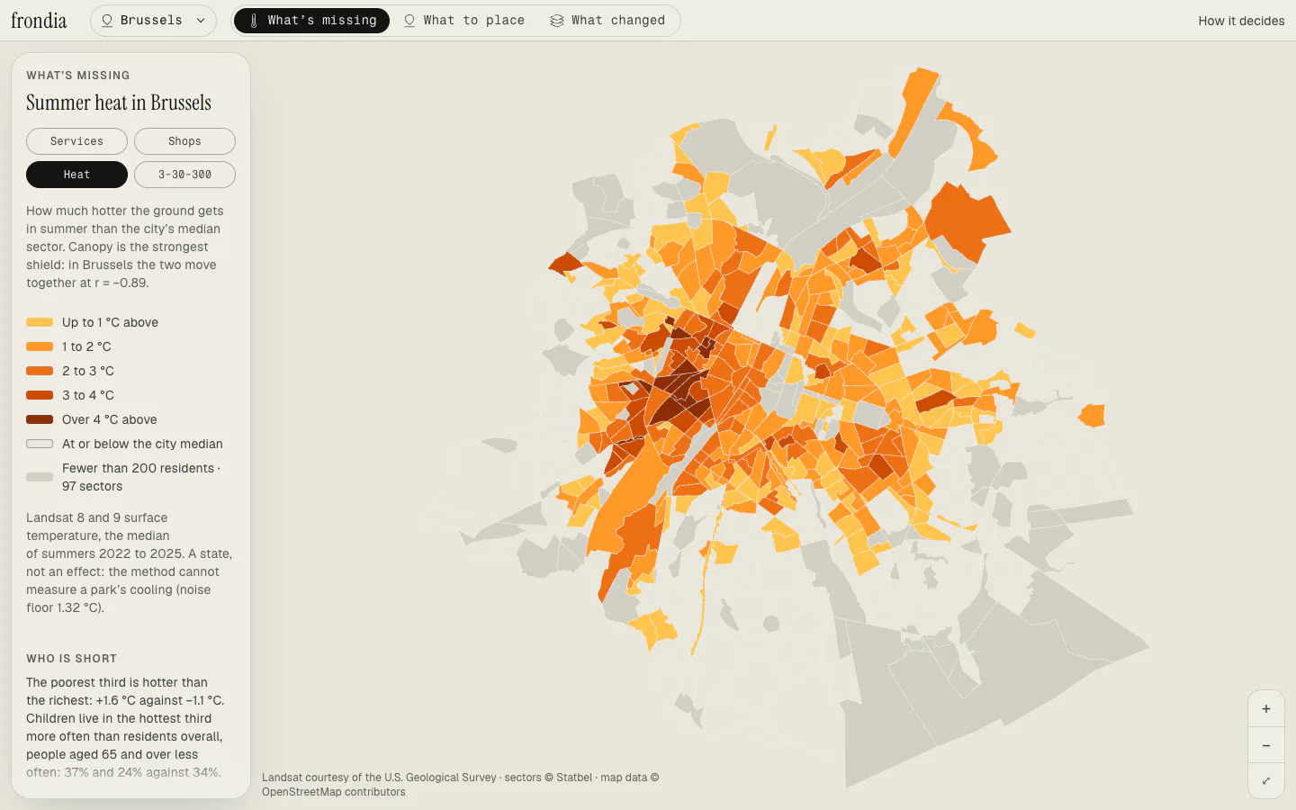
Live — the atlas, five cities
Subtracting twelve places that stayed the same is the whole product in one step
Sources
- Regulation (EU) 2024/1991 of the European Parliament and of the Council on nature restoration (Nature Restoration Regulation), Article 8: urban ecosystems.
- Brown, C. F. et al. (2022). Dynamic World, near real-time global 10 m land use land cover mapping. Scientific Data 9:251. — class probabilities, not shares of the ground
- Konijnendijk, C. C. (2023). Evidence-based guidelines for greener, healthier, more resilient neighbourhoods: introducing the 3–30–300 rule. Journal of Forestry Research 34:821–830.
- Nemhauser, Wolsey & Fisher (1978). An analysis of approximations for maximizing submodular set functions. Mathematical Programming 14. — the guarantee behind the greedy max-coverage ranking