Knowledge Graph Explorer
Type any domain — AI tutoring, CSRD reporting, e-waste circularity — and get an interactive knowledge graph of its concepts, research clusters and product-opportunity areas, built from open data in about thirty seconds. Built solo Nov 2025 – May 2026; 47 automated tests, WCAG 2.2 AA, €0/month
- Problem — Day-one domain orientation costs PMs hours of scattered search; the open data exists, but no tool assembles it into a map
- Insight — The missing layer isn’t visualisation but opportunity reasoning — scoring clusters where research is dense and products scarce
- Solution — I built (solo, end-to-end) a tool that turns Wikidata + OpenAlex into an interactive graph, scored opportunity cards and a brief in ~30s
- Outcome — Live at knowledge-graph-explorer.ontwrpn.com; 47 automated tests, WCAG 2.2 AA, €0/month — portfolio project, no external users yet
Every new initiative starts with the same unstructured slog
Day-one orientation in an unfamiliar domain costs PMs and researchers hours of scattered search. The data needed to answer 'what is this space made of?' already exists in open, freely-licensed datasets — Wikidata and OpenAlex — but no tool assembles it into something you can navigate. Prose AI assistants answer in paragraphs; you can’t spot a cluster, or see where nobody is working, in a paragraph.
The missing layer is not visualisation — that’s table stakes. It’s opportunity reasoning: scoring clusters where research is dense and products are scarce
The entry point: type a topic, pick a region and goal, and the 9-step pipeline kicks off in the background
Fourteen tools surveyed; none reasons about opportunity
As a self-directed project, discovery was a structured competitive-landscape study plus dogfooding — not a programme of external user interviews, and this case is explicit about that. I surveyed fourteen tools across four categories (paper-citation graphs, AI research assistants, note/relationship-graph apps and market-intelligence platforms) and scored each against five capabilities: automatic open-data ingestion, entity-relationship graphing, opportunity detection, structured output and AI synthesis.
The pattern was consistent: paper-graph tools (Connected Papers, ResearchRabbit) have the graph but only over publications, and do no opportunity reasoning. AI assistants (Elicit, Consensus, Perplexity) synthesise into cited prose — strong output, no navigable entity graph. Note-graph canvases (Obsidian, Roam, Kumu) graph beautifully but require you to author every node yourself, which is useless on day one of a new domain. Market-intel platforms (Crayon, Klue) track competitors, not concept domains. None of the fourteen combined all three of automatic open-data ingestion + a true entity-relationship graph + product-opportunity reasoning.
Orient → find structure → spot openings → hand off
The backend runs a nine-step pipeline on demand: Groq expands the topic into ~8 search terms; Wikidata and OpenAlex are queried in parallel; rapidfuzz de-duplicates entities at a similarity threshold of 88; NetworkX computes degree and betweenness centrality; Louvain community detection groups nodes into clusters; an opportunity-scoring model weights size, research density, product gap and bridge potential; Groq writes narrative opportunity cards for the top 5 clusters with a deterministic template fallback. The whole pipeline writes to Postgres and flips project status to ready — the frontend polls every 2.5 s and swaps a building banner for the live graph.
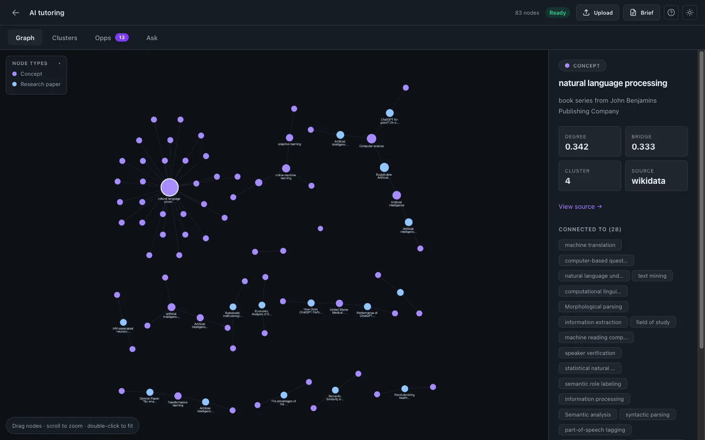
The four post-graph views map exactly to the exploration workflow: the physics-based graph for orientation (drag any node, the whole graph responds), Clusters for finding structure (Louvain communities ranked by opportunity score), Opportunities for spotting openings (cards with risk badges, why-it-matters and an evidence-strength bar), and a one-click Research Brief for handing off — rendered HTML, downloadable .md, printable to PDF.
Live — type any domain and explore the graph
Clusters
Opportunities
Research Brief
Mobile bottom-sheet
Tokens, a bottom-sheet pattern and dense-graph readability
A deliberate pass replaced ad-hoc pixel values with a consistent token system: an 8-pt spacing scale (--sp-1…--sp-20, 4px→80px), a modular type scale (--text-xs 11px to --text-3xl 32px) paired with four line-heights, shared shadow tokens and easing curves. The single biggest mobile win: at ≤767px the desktop side panel becomes a fixed bottom sheet (max-height 58vh) with a drag handle and a dimming backdrop — opening a node or cluster slides it up. One pattern turned a desktop-only graph into something credible on a phone.
Dense-graph readability required its own solution: persistent labels only on the most-connected nodes; the rest reveal on hover, selection or cluster highlight. On an 80+-node graph this keeps the canvas legible instead of a wall of overlapping text. The two-phase cola layout (finite boot → infinite live physics) means all nodes participate in physics continuously — the graph responds to any drag.
Dependency-free spotlight tour: auto-starts on first visit, replayable via the “?” button, keyboard-operable and prefers-reduced-motion aware
A structured review caught two production bugs before users could
Before declaring MVP done I ran a structured code review. It found two genuine production bugs: DELETE /projects/{id} removed entities and relationships but not clusters/opportunities, causing a foreign-key violation that broke delete on production Postgres; and a stored XSS in the brief Print window where LLM-generated Markdown and the user-derived filename were written via document.write with only < escaped. Both fixed and locked behind tests.
The automated suite runs against a throwaway SQLite database with AI disabled — it never touches the production database or Groq. 28 pytest tests across six files cover project CRUD, brief gating, delete-cascade regression, Groq fallback, CSV parsing, entity extraction, the RAG Q&A gate and lexical retrieval ranking. 19 Vitest / Testing Library tests cover theme toggling, state screens, the Ask panel, entity card rendering and safe brief rendering including HTML-escaping and dangerous-link dropping. All 47 pass; the production build is 241 kB initial + 537 kB lazy graph chunk.
The review paid for itself on the delete bug alone — silently broken in production, and a bug no manual click-through had caught
Live, hardened, free — and honest about what is still unvalidated
Live at knowledge-graph-explorer.ontwrpn.com since June 2026. Built solo in seven months alongside other work. Stack is deliberately boring and free: Wikidata + OpenAlex for data (€0), Groq free tier for AI (€0), networkx + python-louvain for graph and metrics (€0), FastAPI + SQLAlchemy 2.0 backend, React + Vite + Cytoscape.js frontend, Docker → Coolify on self-hosted Hetzner (€0 marginal). Every Groq call has a deterministic fallback — AI enriches but is never load-bearing; the product is fully functional with no Groq key.
What I would do differently: write tests alongside the pipeline rather than after (the delete-cascade bug lived for several commits), cap graph nodes earlier for dense topics (layout tuning came after the fact), and name the batch-vs-on-demand trade-off up front so the polling UX gets shaped sooner. The honest read on opportunity scoring: it reliably produces a plausible first map, but whether the scored openings are right needs real PMs reacting to them — that is the next priority, ahead of more features.
The graph canvas: nodes sized by degree centrality, coloured by type (concept / institution / research / product), labels on the most-connected nodes only
Sources
- Blondel, Guillaume, Lambiotte & Lefebvre (2008). Fast unfolding of communities in large networks (Louvain). J. Stat. Mech. P10008.
- Freeman (1977). A set of measures of centrality based on betweenness. Sociometry 40(1):35–41.
- Priem, Piwowar & Orr (2022). OpenAlex: a fully open index of scholarly works.
- Vrandečić & Krötzsch (2014). Wikidata: a free collaborative knowledgebase. Communications of the ACM 57(10):78–85.