Market Opportunity Map
A web tool that turns a folder of research CSVs or pasted notes into a scored, visualised, and printable opportunity map — so a PM can go from raw discovery signals to a defensible brief in under ten minutes, without a spreadsheet in sight
- Problem — PM prioritisation runs on gut feel; research stays scattered, so the assembly step (not the spreadsheet) is the real bottleneck
- Insight — A score earns trust only if it can be interrogated, so a transparent rule-based formula beats a black-box AI verdict
- Solution — I solo-built the full web app (React + FastAPI): CSV/paste in, 4-component 0–100 score, force-directed map, breakdown drawer + printable brief
- Outcome — Live at marketmap.ontwrpn.com, built solo in ~4 weeks; 24 source-linked opportunities, scoring in <200 ms, WCAG 2.2 AA, €0 hosting
The spreadsheet is not the bottleneck — the assembly step is
Product prioritisation runs on gut feel dressed up as rigour. RICE, ICE, Kano — every framework exists, but their inputs are almost never computed from real data. A PM fills a spreadsheet cell with a gut-feel “severity: 7” and the formula multiplies intuitions together. The output looks defensible. It isn’t. The root cause is upstream: market research lives scattered across Dovetail repositories, Notion pages, interview recordings, and Slack threads. Nothing I found assembles it into a form that can be scored. Fixing the spreadsheet formula is useless until the assembly problem is solved.
The spreadsheet is not the bottleneck — the assembly step is
The gap I was targeting: a tool that (1) ingests structured market signals from a simple CSV or rough paste input, (2) scores each opportunity with an auditable four-component formula, (3) visualises the connections between segments, pain points, competitors, and features in a single graph, and (4) produces a printable one-pager a PM can share with stakeholders. None of the tools I looked at does all four. Productboard manages roadmaps but doesn’t score discovery signals. Dovetail stores research but doesn’t surface scored opportunities. Spreadsheets can score but don’t visualise, don’t export briefs, and don’t link back to sources.
Every row grounded in a public source — discipline by design
Rather than building demo data that looked plausible, I grounded every row in publicly available primary signals: Hacker News “Ask HN” threads (January 2026), Lenny’s Newsletter for recurring PM workflow pain themes, McKinsey reskilling research (2024–2025) and CareerKarma annual surveys for the EdTech dataset, and individual vendor pricing pages (Aha, Productboard, Figma, Coursera, Pluralsight) for competitive pricing. Nielsen Norman Group articles and UX research industry surveys anchored the product-tools dataset.
Two datasets, 24 pre-loaded opportunities: the product-tools dataset (senior PMs, UX researchers, design leads) and the EdTech dataset (L&D managers, bootcamp graduates, career switchers). The most consistent PM pain across HN threads was strategy staying in the CEO’s head and never cascading to squad-level decisions. The EdTech top signal: the large majority of L&D teams struggle to prove business value, and only a minority measure training all the way to Kirkpatrick’s Level 4 (business results). Score calibration was intentionally honest — demo top scores cluster at 60–65 (“Worth validating”), not ≥75 (“Strong opportunity”), because claiming a strong verdict without customer validation in a competitive market would be dishonest.
Grounding every row in a public source URL disciplines the scoring and keeps the demo honest. Research quality still matters — the tool scores what you bring in
Transparent scoring, a force-directed map, and a printable brief
The scoring formula is deliberately mechanical — four weighted inputs, no black-box AI, every component visible in a breakdown drawer, every signal linked to a public source. Severity (35%) carries the most weight: the depth of a pain is the signal most likely to drive adoption. Willingness to pay (25%) captures commercial pull. Competition (25%, inverted) rewards underserved niches. Evidence (15%, capped at 10 signals) adds confidence without letting a flood of confirmatory signals override a low-severity problem. A PM who disagrees with a score can change the formula in six lines of pandas and immediately see the effect — that auditability is the point.
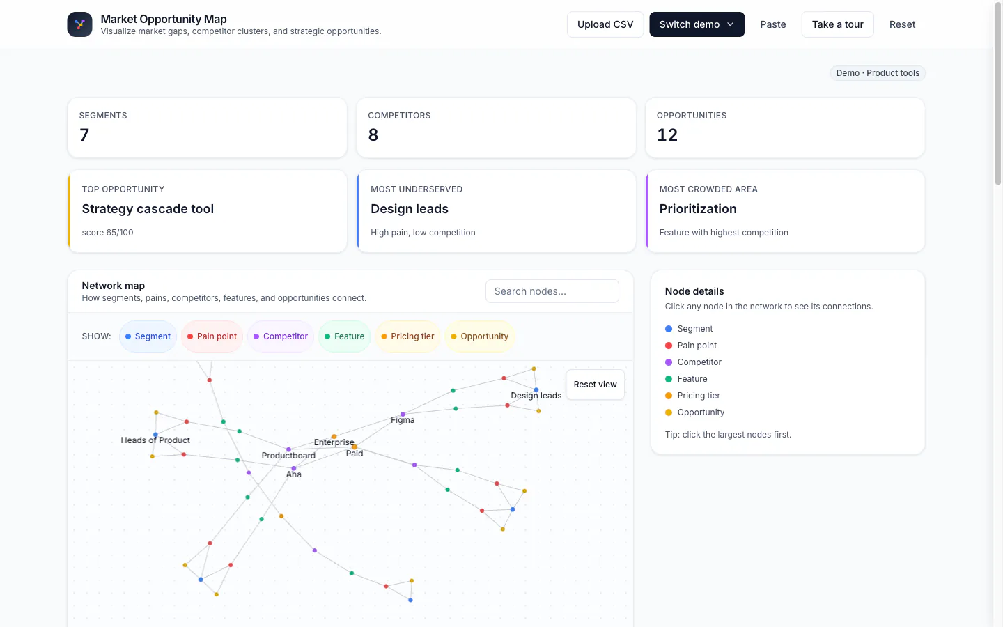
The dashboard: force-directed network map first (six node types, six colours), then the opportunity matrix scatter plot, the competitor heatmap, and the ranked table last — the decision output, not the hook
Three input paths cover the range from structured to rough: a full-schema CSV upload (~5 seconds to first score), a three-tab paste modal (competitors / pains / quotes, heuristic scoring via keyword detection — “frustrated”, “painful”, “broken”) for rough discovery notes, and two pre-loaded demo datasets for first use. Stateless by design — no database, no auth, no persistent server state. All analysis happens at request time using pandas and networkx.
Live — load a demo dataset or paste rough discovery notes and explore
Visuals as hook, explainability as trust
Two deliberate design decisions: put the network graph first, and make every score decomposable. The force-directed graph — six node types in six colours, interactive on hover and click — earns trust before the ranked table asks anyone to read numbers. It’s the entry point to a dense dataset. The breakdown drawer is the second trust-builder: four colour-coded progress bars (severity = red, WTP = blue, competition = purple, evidence = amber) with source URLs inline. A PM reviewing an opportunity can see exactly which inputs drove the score and click through to the original evidence.
Network map: first thing a visitor sees on desktop
Breakdown drawer: every score traceable to its inputs
Each opportunity has a /opportunity/:id/brief route — score components, competitive landscape (which competitors address this segment and which pain points they leave uncovered), top three supporting signals, open questions, and a decision-bucket next step. @media print CSS makes it PDF-safe without a headless browser. The brief page is the most shareable output: a URL, not a screenshot of a spreadsheet.
Printable brief: shareable as a direct URL, PDF-safe via print CSS
Accessibility was a first-class constraint throughout: skip-to-content link, keyboard-navigable table rows (Tab + Enter/Space to open the breakdown drawer), focus traps on the drawer and paste modal, aria-modal and aria-labelledby on all overlays, role="progressbar" on score bars, reduced-motion support, and a minimum contrast ratio of 7.0:1 on muted text. WCAG 2.2 AA throughout.
Four weeks, solo, from hypothesis to shipped — and what I’d change
Built in four gated weeks (13 January – 10 February 2026): Week 1 shipped CSV upload → scored table, network graph, opportunity matrix. Week 2 added the competitor feature heatmap, the paste modal (friction was the main first-use blocker — added earlier than planned), and a full WCAG 2.2 AA accessibility pass. Week 3 delivered the opportunity brief page, Copy as Markdown, and PDF export via print CSS (added when mobile testing revealed no clean output path). Week 4: guided tour via driver.js, the EdTech demo dataset, visual polish.
Stack: React 18 + Vite + Tailwind CSS on the frontend, react-force-graph-2d (canvas-based, handles 50+ nodes without layout jank), Recharts for the opportunity matrix scatter plot, driver.js (13 KB gzipped) for the guided tour. FastAPI + Python on the backend, pandas for the six-line scoring formula, networkx for graph construction, slowapi for 15 req/min per-IP rate limiting on write endpoints. Single Docker container on Coolify (Hetzner), uvicorn serves the SPA and /api on one origin, auto-deploys from GitHub on push. €0 hosting, 7 API endpoints.
What I’d do differently: lead with the paste modal, not the CSV — most visitors don’t arrive with a research CSV ready, and the paste modal is lower-friction for a first demo. Add shareable session URLs earlier — the brief page is shareable, but the full scored dashboard is session-only; a /session/:id route backed by a 24-hour key (Redis or Upstash) would let PMs share the entire map. The EdTech dataset was built in the final week under time pressure — solid but less deeply sourced than the product-tools dataset.
Live, sourced, and honest about what comes next
Live at marketmap.ontwrpn.com as of 10 February 2026. Two fully researched demo datasets, 24 source-linked opportunities, WCAG 2.2 AA, €0 hosting. Top demo scores cluster at 60–65 (“Worth validating”) — intentionally, not accidentally. The north-star metric: a PM goes from a research CSV to a shared opportunity brief in under ten minutes. That flow works end to end. The next-quarter bets: collaborative scoring (multiple team members contribute inputs, scores averaged for debate), AI-assisted clustering (paste raw interview transcripts, an LLM extracts pain points before scoring begins), and shareable session URLs backed by Upstash Redis.
Sources
- Kirkpatrick four-level training-evaluation model (Level 1 Reaction → Level 4 Results). — the L&D figures in the demo dataset are illustrative