SpotFinder Geo
SVP Consulting kept being asked ‘where should I open?’ with no repeatable way to answer it. I built SpotFinder: an open-data opportunity map that scores Antwerp’s ~450 sectors with three type-specific formulas, an AI zone-explainer, and honest ‘signals, not verdicts’ framing — cutting a 2.5-day manual scan to ~0.5 day
- Problem — SMB food clients kept asking SVP “where should I open?”; each manual scan cost ~2.5 analyst-days across 5–6 sources
- Insight — one score can’t fit three business types, and a defensible read needs a plain-language reason attached
- Solution — I solo-built an open-data opportunity map (OSM + Statbel) scoring Antwerp’s ~450 sectors with 3 type-specific formulas + AI explainer
- Outcome — internal R&D tool, live; early signal (n=2): ~2.5 days → ~0.5 day, 5–6 sources → 1, confidence 2.4 → 4.3, €0 hosting
Location is the highest-stakes decision a small food business makes — and we had no repeatable way to advise on it
SVP Consulting is a five-person AI firm in Antwerp. We help European SMBs put data to work — which is exactly why a recurring client question kept landing on our desk without a rigorous answer: ‘Where should I open?’ Each time, we either declined the work or improvised a manual desk study. An internal time audit across 4 past scans put the pain in numbers: ~2.5 analyst-days per question, touching 5–6 sources (OSM, the Statbel portal, a spreadsheet, maps, a notebook), in different formats, none of it shaped like an answer.
The pain wasn’t a lack of data — Antwerp is richly mapped and Belgium publishes excellent open statistics. The pain was the seams: stitching incompatible sources into a type-aware, defensible read, every time, from scratch
The café layer on Antwerp’s ~450 statistical sectors. Red = oversupplied / low demand, green = underserved opportunity
Three interviews, four audited scans, one finding: the rationale was the trust unlock, not the map
Discovery ran 23–25 March 2026 in parallel with standing up the alpha skeleton. I audited 4 past location scans from our 2025 work (median: 2.5 days, concentrated in data-gathering), ran 20-minute interviews with the CEO, AI engineer, and junior specialist, and did an open-data recon across OSM/Overpass and three Statbel datasets to confirm the inputs existed at usable granularity for free.
The team interviews surfaced the actual unlock. CEO: ‘I can sell where, but only if I can explain why in one sentence a client believes.’ AI engineer: ‘If the scoring is a black box, I won’t stand behind it.’ Junior specialist: ‘I’d just count competitors and guess.’ The status quo was intuition dressed as analysis. A ranked map without a defensible reason was already solved — nobody trusted it. The explanation was the product.
A defensible scan is not just a ranking — it is a ranking with a plain-language reason attached. That single insight shaped two later decisions: type-specific scoring and the AI zone-explainer
One score cannot fit three businesses — so I built three formulas, one choropleth, and a plain-language zone explainer on top of an LLM
The core of the tool is three distinct scoring formulas — not one weighted sum. A café is a daytime destination (scored on traffic, transit, income; penalised by competition). A bakery is a convenience good (scored on residents, distance-to-nearest-bakery, income; competition is a divisor). A confectionery is a discretionary treat (scored on income, a traffic/residents blend; penalised by competition). Every input is min–max normalised across all sectors first; the raw score becomes a within-type percentile so a café is never ranked against a bakery. Two gates prevent confident nonsense: a noise gate nulls sectors with too few establishments, a viability gate nulls uninhabitable polygons. An empty number is more honest than a fabricated one.
Bakery layer: re-scored by the proximity-gap formula. Sectors that are distant from any existing bakery score highest
Detail panel: opportunity percentile, type-adaptive input breakdown, nearest-competitor distance, mini-map locator
The AI zone-explainer is a Gemini call that takes the sector’s real inputs and produces one plain-language sentence: ‘High foot-traffic proxy (top 15%), low café density (2 within 400 m), above-median income — an underserved daytime-destination corridor.’ If the API is down, a deterministic template fires instead. The explanation is labelled ‘AI’ or ‘template’ so the user always knows which one they’re reading. A collapsible Customise blend re-weights the map live on four drivers with presets (balanced, footfall, residential, affluence) — and the whole state is shareable via URL.
Customise blend: re-rank sectors live without inventing new data. Full state is URL-shareable
AI zone-explainer: a Gemini-generated sentence from real inputs, labelled so the user knows its source
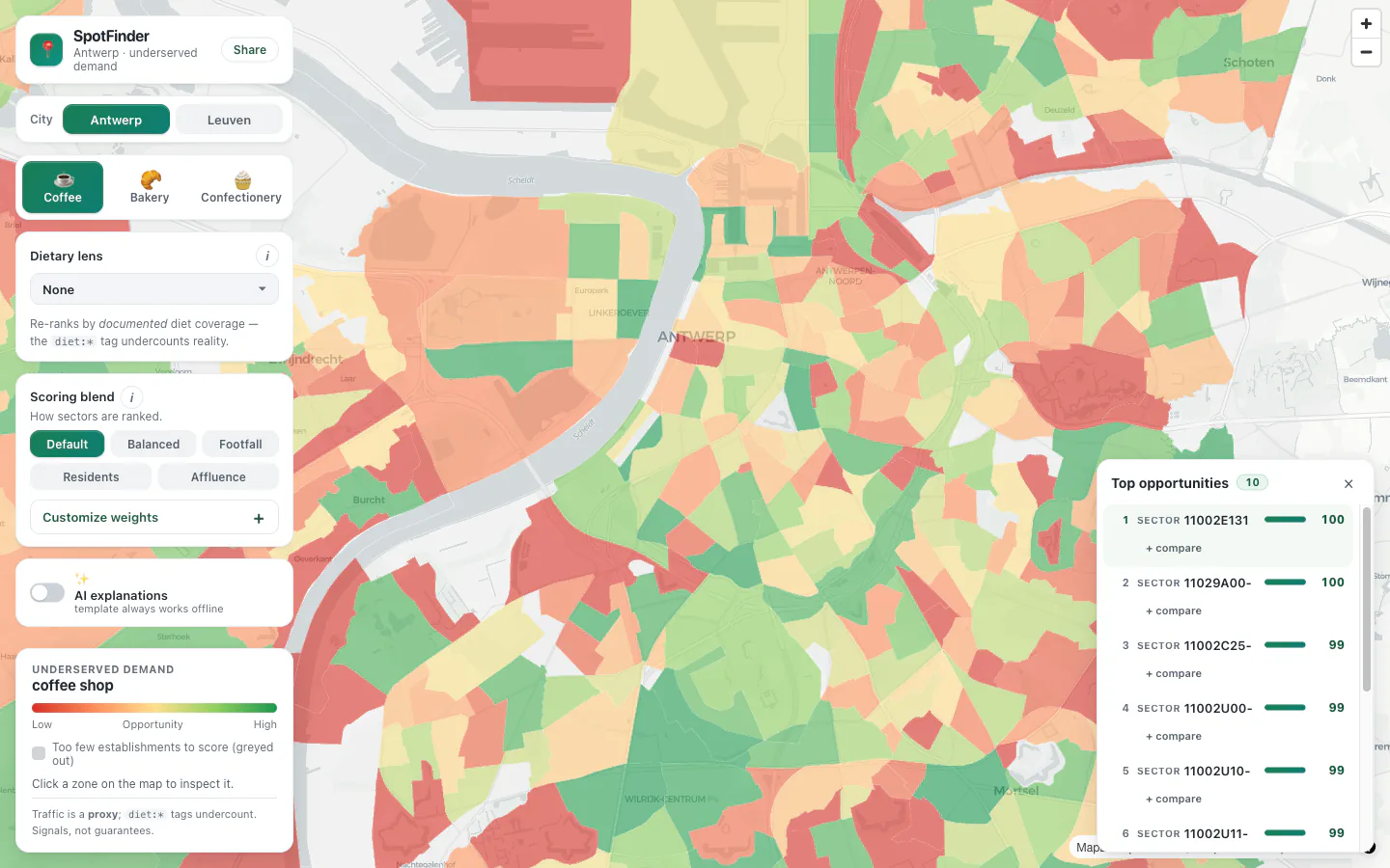
Live — select a city, pick a business type, click any sector
Heavy compute stays offline; the free-tier request path is just ‘read cached bytes’
The architecture has three isolated layers touching through one file and one endpoint. An offline Python pipeline (geopandas/shapely) fetches and reprojects OSM + Statbel, aggregates onto statistical sectors, computes every score, and bakes a single antwerpen.geojson. A thin FastAPI backend serves that file and the explainer. A static React + MapLibre GL JS frontend paints the choropleth. The heavy compute is deliberately offline so the request path on the free tier is read-only — no timeout lottery, no cold-start on the data query itself. Dietary lenses (vegan, vegetarian, halal coverage from OSM tags) are a fourth overlay, explicitly labelled as undercounts.
Dietary lens: vegan coverage from OSM tags, explicitly labelled an undercount
Mobile: bottom-stacked leaderboard + legend, no overlap with the map
Early signal (n = 2): 2.5 analyst-days to ~0.5 day, 5–6 sources to 1, analyst confidence from 2.4 to 4.3
The tool went into internal use on 18 April 2026 after a ~3.5-week solo build (23 March – 17 April). First two weeks post-demo, two client scoping questions: time to a defensible shortlist ~4 hr (target ≤ 6 hr, baseline 20 hr); sources per scan 1 (from 5–6); analyst confidence 4.3/5 (from 2.4); ~74% of Antwerp sectors scorable; cold-start latency ~40 s (within the ≤ 50 s target, though sluggish in a live demo). Hosting cost €0 on Render’s free tier, Gemini on the free tier. Projected annual time saving at 6 questions/year: €5,760 — a pure-cost payback inside ~13–14 months. Honest caveat: these four readings rest on n = 2. They are a direction, not a destination.
CEO: ‘First time I could answer “why there?” without hand-waving.’ AI engineer: ‘The method is legible — I’d put my name on this in front of a client.’ Junior: ‘I’d have spent two days on what this did before the coffee went cold.’
What I’d do differently: talk to an actual café owner sooner (I interviewed the team, not an end client, until late — the rent question would have surfaced earlier); defer the dietary lenses (elegant but rarely the deciding factor); ship the share-link on day one instead of last. H4 — that users would want the custom blend — is trending against: used rarely in the two live scans, and will be deprioritised. Next quarter: a second city (Leuven) to prove the pipeline generalises, a rent-proxy research pass, point-level validation tooling, and a calibration pass to replace judgement-set weights with ground-truth evidence.